Understanding Digital Anime Coloring Basics
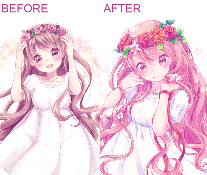
Digital anime coloring tips – Digital anime coloring offers a dynamic and versatile alternative to traditional methods, providing artists with a wealth of tools and techniques to achieve stunning results. While traditional coloring relies on physical media like paints and markers, digital coloring utilizes software and a computer to manipulate color and achieve precise effects. This shift opens up possibilities for corrections, experimentation, and a level of control rarely achievable with traditional methods.Digital anime coloring differs significantly from its traditional counterpart in several key aspects.
Traditional methods involve layering physical paints or inks, making corrections difficult and time-consuming. Digital coloring, however, allows for easy correction and modification through layers, non-destructive editing, and the use of digital tools like brushes and blending modes. The workflow itself is also vastly different, with digital art relying heavily on the use of a computer and digital drawing tablet, while traditional art relies on physical materials and techniques.
The accessibility of digital resources, like pre-made brushes and textures, also provides a significant advantage.
Essential Software and Hardware
Choosing the right software and hardware is crucial for a smooth and efficient digital anime coloring workflow. The software you choose will largely determine your capabilities and workflow, while the hardware impacts your comfort and precision.
Popular software options include Adobe Photoshop, Clip Studio Paint, and Krita. Photoshop offers industry-standard tools and extensive features, though it comes with a subscription fee. Clip Studio Paint provides a robust feature set tailored for comic and manga creation, often favored for its intuitive interface and reasonable pricing. Krita, a free and open-source alternative, offers a surprising range of capabilities and is a great option for those on a budget.
Hardware requirements are less demanding than they once were, but a graphics tablet is highly recommended. Wacom tablets, particularly the Intuos and Cintiq lines, are industry standards known for their responsiveness and precision. However, more budget-friendly options from Huion and XP-Pen offer comparable performance at lower price points. A computer with sufficient processing power and RAM is also essential to prevent lag and crashes, especially when working with large files.
Setting Up a Digital Art Workspace
Creating an efficient workspace is key to maximizing productivity and comfort. This involves not only the physical setup of your equipment but also the organization of your digital files and software settings.
Physically, ensure you have a comfortable chair and desk setup that allows for proper posture and minimizes strain. The position of your monitor, tablet, and keyboard should be ergonomically sound to prevent discomfort during long work sessions. Good lighting is also important to avoid eye strain. Consider using a drawing glove to reduce friction and improve control on the tablet surface.
Digitally, organize your files using a clear and consistent folder structure. This makes it easy to locate your assets and projects. Within your chosen software, customize your brush settings, keyboard shortcuts, and workspace layout to suit your preferences. Experiment with different settings to find what works best for your coloring style. Regularly save your work to prevent data loss and consider using cloud storage for backups.
A well-organized workspace contributes significantly to a smooth and enjoyable digital art experience.
Techniques for Layering and Blending
Mastering layering and blending is crucial for achieving depth, realism, and a polished look in your digital anime coloring. These techniques allow you to manipulate colors and create complex interactions, moving beyond flat coloring to achieve a professional aesthetic. Effective use of layers and blending modes significantly impacts the overall visual impact of your artwork.
Layering Techniques for Depth and Dimension
Layering is fundamental to digital painting. By strategically placing layers on top of each other, you can build up complexity and depth. For anime coloring, consider using separate layers for base colors, shadows, highlights, and details like hair strands or clothing folds. This allows for non-destructive editing; changes to one layer won’t affect others. For example, you might have a base color layer, followed by a shadow layer set to “Multiply” blending mode for a natural shadow effect.
Then, a highlight layer set to “Overlay” or “Screen” would add luminosity. Further layers can be used for adding details such as blush, or specific textures. Experiment with layer order to see how it affects the final result. Remember to name your layers clearly to maintain organization as your artwork progresses.
Blending Modes: Multiply, Overlay, and Screen
Blending modes alter how layers interact with each other. They offer a non-destructive way to combine colors and create a wide variety of effects. Three commonly used blending modes in anime coloring are Multiply, Overlay, and Screen.
| Blending Mode | Visual Effect | Description | Example in Anime Coloring |
|---|---|---|---|
| Multiply | Darkens the underlying layer. Useful for shadows and creating depth. | Multiplies the colors of the top and bottom layers. The resulting color is always darker than the base color. | Applying a dark brown layer in Multiply mode over a skin base color creates a natural shadow. |
| Overlay | Creates a more balanced effect, depending on the base color. Brightens light colors and darkens dark colors. | Combines the aspects of both Multiply and Screen modes. | Adding a bright pink layer in Overlay mode over a base skin color creates a subtle blush. |
| Screen | Brightens the underlying layer. Ideal for highlights and adding luminosity. | Combines the colors of the top and bottom layers inversely. The resulting color is always brighter than the base color. | Applying a bright yellow layer in Screen mode over a hair base color creates a glowing highlight. |
Using Clipping Masks to Contain Colors
Clipping masks are invaluable for keeping colors within specific boundaries. This prevents accidental coloring outside designated areas, like keeping hair color within the hair Artikel or preventing shadow bleed. To create a clipping mask, select the layer you want to constrain (e.g., the shadow layer) and then select the layer you want to use as a boundary (e.g., the base color layer).
Right-click and select “Create Clipping Mask”. Now, any color added to the shadow layer will only be visible within the area defined by the base color layer. This keeps your artwork clean and organized, simplifying the coloring process and preventing messy edges.
Advanced Shading and Lighting Techniques
Mastering shading and lighting is crucial for bringing depth and realism to your anime digital art. This section explores advanced techniques to elevate your coloring skills beyond the basics. We will delve into different shading styles, a step-by-step guide to realistic shadow and highlight creation, and the critical role of light sources in shaping the final artwork.
Anime Shading Styles
Three prominent shading styles frequently employed in anime are cel-shading, soft shading, and gradient shading. Cel-shading utilizes stark contrasts between light and shadow, creating a bold, graphic look often seen in classic anime. This technique is characterized by its distinct, flat areas of color with minimal blending. Soft shading, on the other hand, employs a more subtle approach, gradually transitioning between light and shadow with smooth gradients.
This results in a softer, more realistic feel. Finally, gradient shading combines elements of both, using a combination of sharp and soft transitions to create depth and visual interest. The choice of shading style depends greatly on the desired aesthetic and the specific style of anime being emulated.
Creating Realistic Shadows and Highlights
Achieving realistic shadows and highlights involves a methodical approach. First, identify your primary light source. Let’s assume it’s a single, bright light positioned above and slightly to the left of the subject. Second, determine the core shadow area—the area directly opposite the light source, which will be the darkest. Using a darker shade of your base color, carefully paint this area.
Third, gradually soften the edges of the core shadow by blending it into the surrounding areas using a soft brush and lower opacity. This creates a natural transition between light and shadow. Fourth, add highlights. These are areas where the light directly hits the subject. Use a lighter shade of your base color, or even white, to create these highlights, focusing on areas like the top of the hair or cheekbones.
Finally, refine the shadows and highlights by adjusting their intensity and blending further, paying attention to the overall form and volume of the subject. This iterative process allows for a precise and realistic rendering of light and shadow.
Light Source Influence on Artwork
The placement and type of light source significantly impact the overall look of your artwork. A single, strong light source will create dramatic contrasts and strong shadows, while multiple light sources or diffused light will produce a softer, more even illumination. The color temperature of the light source also plays a role. Cool-toned light (blues and purples) creates a colder, more melancholic mood, while warm-toned light (oranges and yellows) evokes a warmer, more inviting atmosphere.
Consider the mood and atmosphere you want to convey when choosing your light source and its characteristics. For example, a scene set at night might use a cool-toned moonlight as its primary light source, casting long, dramatic shadows. In contrast, a daytime scene might utilize warm sunlight, creating brighter, more cheerful illumination.
Adding Texture and Detail
Adding texture and detail is crucial for elevating your digital anime coloring from flat to dynamic. By skillfully employing various digital painting techniques and brush settings, you can imbue your artwork with a sense of realism and visual richness, enhancing the overall impact and believability of your characters and environments. This involves not only manipulating color and light but also understanding how different textures interact and contribute to the overall composition.
Successfully integrating texture and detail requires a thoughtful approach to both your line art and your coloring process. Detailed line art provides a solid foundation upon which to build complex textures, while careful consideration of brush settings allows you to precisely control the application of these textures to different elements within your artwork. The interplay between line art and coloring is key to achieving a polished and professional finish.
Mastering digital anime coloring involves understanding light, shadow, and color blending. For practice honing your skills with complex details, consider exploring resources like difficult animal coloring pages site pinterest.com ; the intricate details found there can translate well to the challenges of anime hair and clothing. Applying these refined techniques will elevate your digital anime coloring to a new level.
Texturing Clothing, Hair, and Skin
Creating believable textures for clothing, hair, and skin significantly impacts the realism of your anime artwork. For clothing, consider the fabric type. A crisp cotton shirt will have different textural qualities than a flowing silk kimono. For hair, the texture will depend on factors such as length, style, and even the character’s personality. Similarly, skin texture varies depending on age, ethnicity, and lighting conditions.
To achieve these effects, experiment with different brushes and blending modes. For example, a rough, textured brush can simulate the weave of a fabric, while a softer brush can be used to create the smooth surface of skin. The use of layer masks allows for precise control, enabling you to selectively apply texture to specific areas without affecting the underlying colors.
Creating Detailed Line Art
Detailed line art serves as a robust foundation for textured coloring. Clean, precise lines create a clear silhouette, allowing the textures to stand out effectively. Varying line weight adds depth and dimension, emphasizing folds in clothing or strands of hair. A combination of crisp, sharp lines and softer, more fluid lines can be used to create a sense of movement and energy.
For example, sharper lines might be used for the edges of a character’s clothing, while softer lines could depict the flow of their hair.
Consider using a combination of different line art styles. For instance, you could use a cleaner line style for the main Artikels and a more sketchy, textured line style for details such as wrinkles or hair strands. This layering of line styles can create a more visually interesting and complex image.
Brush Settings and Their Effects on Texture Creation
Understanding brush settings is paramount for effective texture creation. Different settings can dramatically alter the final appearance of your artwork. Experimentation is key to discovering the optimal settings for your desired effect.
- Opacity: Lower opacity creates a softer, more blended texture, while higher opacity results in a more defined, pronounced texture. A low opacity brush is ideal for subtle shading and blending on skin, whereas a high opacity brush is perfect for sharp details in clothing or hair.
- Flow: Similar to opacity, lower flow creates a more gradual application of color and texture, allowing for more controlled blending. Higher flow delivers a more immediate and intense application of color and texture, useful for creating strong contrasts and distinct textures.
- Spacing: This setting controls the distance between brush strokes. Higher spacing creates a more broken, textured effect, ideal for simulating things like rough fabric or messy hair. Lower spacing results in smoother, more continuous strokes, perfect for smooth surfaces like skin.
- Brush Shape: Different brush shapes (round, square, textured) create vastly different textures. A round brush is versatile, suitable for a wide range of applications, while a square brush creates sharper, more defined edges. Textured brushes, often mimicking real-world tools, can directly add texture to your artwork.
Illustrative Examples of Digital Anime Coloring
This section provides three distinct examples showcasing diverse digital anime coloring approaches. Each example highlights specific color palettes, shading techniques, and textural elements to achieve unique visual styles. Understanding these examples will enhance your ability to apply various techniques effectively in your own work.
Example 1: A Determined Swordsman
This illustration features a young swordsman, clad in dark blue armor accented with silver. The color palette is predominantly cool-toned, utilizing deep blues, grays, and muted greens. The armor is rendered with a metallic sheen, achieved through subtle highlights and reflections. The swordsman’s skin tone is a warm, light tan, contrasting with the cooler tones of his attire.
Shading is employed strategically to emphasize the musculature and form of the character, using a combination of airbrushing and cell shading techniques. A subtle texture is applied to the fabric of the armor to give it a sense of weight and realism. The background is a muted, desaturated green forest, further emphasizing the cool tones of the overall piece.
Example 2: A Mystical Forest Spirit
This illustration depicts a ethereal forest spirit with flowing, translucent hair. The color palette is warm and vibrant, featuring soft pinks, oranges, and greens. The hair itself is a complex blend of these colors, with highlights and lowlights carefully placed to create a sense of depth and movement. A soft airbrush is used to create a luminous effect, giving the hair a slightly glowing quality.
The spirit’s skin is pale and translucent, almost glowing, suggesting an otherworldly quality. The background is a lush forest scene with vibrant greens and soft light, further enhancing the mystical atmosphere. The textures used are subtle, focusing on the soft, flowing quality of the hair and the delicate features of the spirit. The overall effect is one of gentle light and airy movement.
Example 3: A Cyberpunk City Wanderer
This illustration showcases a character navigating a neon-lit cyberpunk cityscape. The color palette is a striking contrast of vibrant neon pinks, blues, and greens against a dark, almost black background. The character’s clothing features sharp lines and reflective surfaces, creating a futuristic aesthetic. The shading is strong and dramatic, utilizing harsh shadows and highlights to emphasize the character’s form and the environment’s harsh lighting.
Textures are used to create a sense of gritty realism, particularly in the city’s architecture and the character’s worn clothing. The overall effect is one of high contrast and dynamic energy, capturing the vibrant and sometimes harsh atmosphere of a cyberpunk setting.
Coloring Complex Hair: A Step-by-Step Example, Digital anime coloring tips
This example focuses on coloring a character with long, flowing, multi-colored hair. The process begins with a base color, a medium shade of purple in this instance. Subsequent layers introduce progressively darker shades of purple to create depth and form. Highlights are added using a lighter shade of purple and even hints of pink and blue, strategically placed to mimic the way light would reflect off individual strands.
Further refinement involves using a slightly desaturated purple in the shadowed areas, ensuring a smooth transition between light and dark. Finally, very fine, light highlights are added to simulate individual strands catching the light, giving the hair a sense of movement and life. The process requires patience and attention to detail, with each layer subtly building upon the previous one.
The overall effect creates a realistic and dynamic representation of complex hair, showing depth and movement.
Refining and Polishing Your Artwork: Digital Anime Coloring Tips

The final stages of digital anime coloring are crucial for transforming a good piece into a truly exceptional one. Refining and polishing your artwork involves a series of subtle adjustments that significantly impact the overall impact and visual appeal. These final touches elevate the piece beyond the initial coloring stages, creating a cohesive and professional finish.Color correction is paramount in achieving a harmonious and visually pleasing result.
It allows for adjustments to the overall color balance, correcting any inconsistencies or unwanted hues that may have emerged during the layering and shading processes. Effective color correction can enhance the mood, create a unified atmosphere, and bring a sense of professionalism to your work.
Color Correction Techniques
Color correction involves manipulating the hue, saturation, and brightness (HSB) or the red, green, and blue (RGB) values of your artwork. Many digital painting programs offer tools such as curves, levels, and color balance adjustments. For example, using curves, you can selectively target specific color ranges and adjust their brightness or saturation. This allows for precise control over the overall color palette, addressing issues like overly saturated reds or dull blues.
Using the color balance tool, you can subtly shift the overall color temperature, perhaps warming up a cool scene or cooling down a warm one to better suit your artistic vision. The levels tool offers a similar but more direct approach, allowing for adjustments to the tonal range of the image.
Enhancing Contrast and Vibrancy
Improving contrast and vibrancy adds depth and visual interest to your anime coloring. This can be achieved through various techniques. Increasing local contrast, for example, will make individual elements pop more, enhancing the three-dimensionality of the subject. This can be done using techniques such as sharpening filters or carefully adjusting the values of highlights and shadows to create more pronounced differences in tone.
Global contrast adjustments, on the other hand, affect the overall brightness range of the piece. Using tools like levels or curves, you can expand the dynamic range, resulting in richer blacks and brighter whites. To increase vibrancy, you can selectively boost the saturation of specific colors, creating a more lively and energetic piece. However, it’s crucial to avoid oversaturation, which can lead to an unnatural or jarring effect.
A subtle increase in vibrancy often yields the best results.
Identifying and Fixing Common Mistakes
Even experienced digital artists make mistakes. Common errors in digital anime coloring include inconsistent line art, uneven shading, muddy colors, and lack of contrast. Identifying these issues requires a careful review of your artwork, ideally with fresh eyes after a break. For inconsistent line art, you might need to refine the lines using a smaller brush size and careful attention to detail.
Uneven shading can be addressed by carefully blending and refining the gradients, ensuring smooth transitions between tones. Muddy colors can often be corrected through color correction techniques or by desaturating overly vibrant areas. A lack of contrast can be addressed by enhancing the highlights and shadows, or by using a more varied color palette. Regularly saving your work in different stages allows you to revert to earlier versions if necessary, providing a safety net against significant errors.




0